Happy Spring, Everyone!
Recently, I decided to enroll in a specialization in Applied Data Science with Python by University of Michigan on Coursera. I’d been experimenting with Python for a while, but decided I wanted to take a more structured approach to it. I completed the Introduction to Data Science in Python course a few weeks ago, and learned a lot in a short period of time. Most of my work revolved around the manipulation of data in Pandas data frames. I did all the work in Jupyter notebooks. I have to say that I love The Anaconda platform from Continuum Analytics because everything is in one neat, easy to install package.
I’m about 2 weeks into the second course, Applied Plotting, Charting & Data Representation in Python. We’re focusing on visualizations – what makes them good, bad or misleading, and how to create them in matplotlib. I’m used to working with SQL and my biggest frustration in learning Python is knowing what I want to do, knowing exactly how I would do it in SQL, but then having to figure out how to translate that into Python’s syntax. However, Python is so user-friendly and powerful that usually I end up saying to myself, “oh, it was THAT simple?”
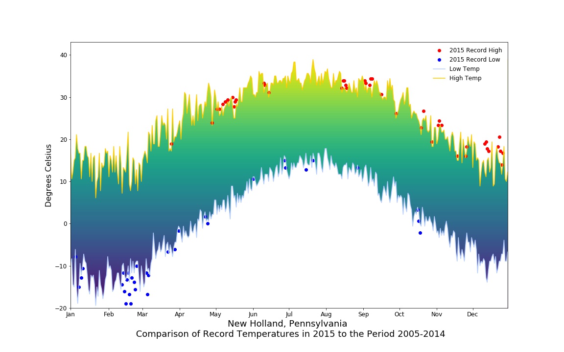
Our first big assignment was to visualize weather data from our local area. We took record highs and lows for the periods from 2005-2014, then overlaid 2015 data to show where records were broken for those years. Here’s my first visualization! You can see that we had a very cold February in 2015, while the rest of the year was on the warm side.
I will be posting a new section of Python resources on this site very soon, which I will update as I continue my adventure. Cheers!
Find me here: