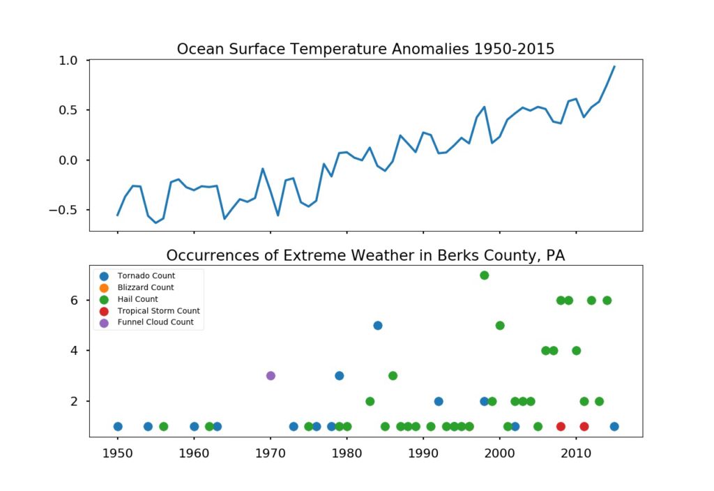
Earlier this month, I finished the a course on Applied Plotting, Charting & Data Representation in Python with an assignment to look at local weather data. The assignment itself was fairly open-ended, so I decided to try to determine if I could see a relationship between global ocean surface temperatures and local weather.
Even though we live well inland, you can see that as the ocean surface temperature trends up, so does severe weather. Specifically, I looked at occurrences of the most damaging types of weather – Tornadoes, Funnel Clouds, Blizzards, Hail and Tropical Storms. I thought we’d been having hail storms more frequently over the past few years. Now, I know it’s not my imagination!
My takeaways from this? Not only is python a powerful tool for graphing, but weather is an increasingly hostile force. So if you live in Southeastern Pennsylvania, make sure your insurance covers hail damage.
Sources:
https://www.ncdc.noaa.gov/cdo-web/datatools/lcd
https://www.epa.gov/sites/production/files/2016-08/sea-surface-temp_fig-1.csv

